The perfect living room - Image via
Presentation of a rental property is paramount in attracting the right tenant and maximum dollars. If the property is vacant, or you have messy tenant photos, it can be difficult for some people to visualise how they may live in a space. Also, your property will be competing with other rental properties in the area, so it's therefore important yours stands out. This is where home staging can make all the difference and it doesn't mean staging every room in the house, renting the basics and adding your own touches, can be all you require.
Firstly, I hear you say, "home staging can be expensive" or "my tenant is still in the property and the place looks a mess". I believe that it is worth the money to have your property vacant for a few days and void of any tenants furniture to be able to stage it and take photos that you will be able to use for future advertising. As my blog focuses on images, I found some inspiring photos to guide you through my tips. If you are a new landlord, there is a great post on "Being a Better Landlord" which you may want to read later.
The two images below are an example of how welcoming a room can look after staging. This living room has been staged by thelook.co.nz, staging has been kept simple but the impact is big.
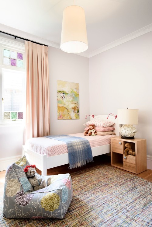
You don't necessarily require a company to stage the entire house, I recommend staging the master bedroom, possibly a child's bedroom (if a family home), the kitchen and living/dining area. If you follow my tips you should be able to stage the kitchen and bathrooms yourself and if you are on a tight budget, there is a trick to staging bedrooms without using actual beds (see tip 6 below). There are home staging companies where you can rent furniture items allowing you to stage the property yourself. You could either rent the furniture for the time you are advertising and showing to prospective tenants, alternatively you could simply stage it for the advertising photographs alone. Adding little nuances to make the property look welcoming such as flowers, throws, towels etc cost very little for the impact.
Before you jump to my tips, think of the type of tenants you are looking for as staging and styling your property should reflect this:
- What type of tenant you are you looking for; A retired couple, business couple, student or family. Home stage to suit your prospective buyer.
- Think about the size of a room when selecting furniture and keep furniture to a minimum, don't fill the entire space, this allows prospective tenants to visualise how their furniture may look/fit.
- For example, if it is a small two bedroom apartment you won't want to fill it with ornate, large pieces. Opt for contemporary, stylish furniture and style the spare bedroom as a guest bedroom not a child's room, as you are more likely to be attracting a young couple or maybe retirees.
- When renting furniture yourself, don't choose your personal style, if you are into antiques, shabby chic or French style steer clear of trying to re-create this look. Think clean lines, modern, minimalist, yet stylish and keep any vignettes simple, this way you will attract a wider audience.
Staging Tips
2. Kitchen - All that is required in a kitchen is a little colour, green and lemon work well, in a white kitchen. You can't go past a bowl of crisp green apples or lemons (image below). Alternatively a clear glass vase of green foliage and flowers on an island bench can look fabulous.
Image via Gabor & Allen
Above: A rustic bowl of green vegetables can make a statement - Image is my own, shot from Interior Designer, Irene Creans home
3. living room - Keep it minimal, a clean lined, modern sofa in white, beige or pale grey and two contrasting chairs are all you require for seating. A modular sofa could be selected for small rooms. If you have room and budget, a coffee table or two side tables or lamp table can make all the difference. Use cushions on the sofa and chairs to soften the space and introduce a pop of colour or pattern. A simple glass vase with flowers and maybe a couple of books stacked on the coffee table is all you need for styling. Remember to keep things simple, no clutter. A throw is not necessary, however it can add warmth and texture.Above: A rustic bowl of green vegetables can make a statement - Image is my own, shot from Interior Designer, Irene Creans home
Image via - Tobi Fairley Interior Design
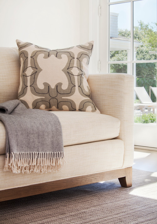
Above: A throw can add texture and make the image look more welcoming. You may wish to use a rug and if you do, make sure it is the right size for the space, you can read more about this in a previous post - Image via Janis Gosbee Design
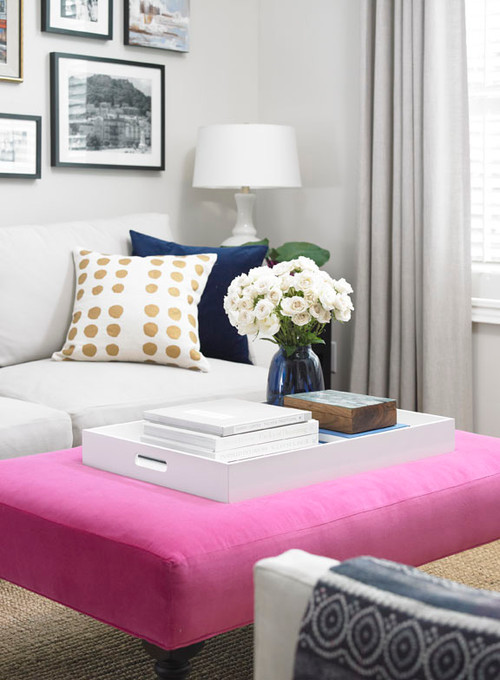
Above: A tray can hold a couple of items and be placed on a coffee table or ottoman such as in this image via - Cynthia Hayes Interior Design
4. DO NOT - Place furniture in front of bi fold doors or French doors that lead to the garden unless there is no alternative and you leave a wide space between them for easy access.
Above - A decent space has been left behind this pair of chairs. Image via Janis Gosbee Design Inc
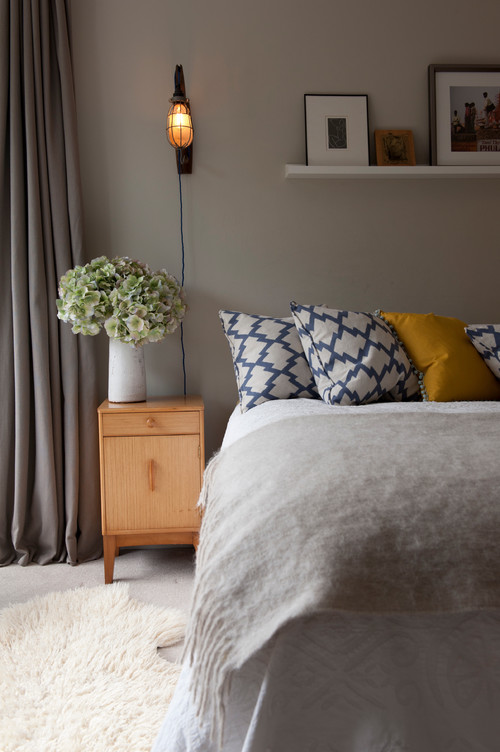
6. Master bedroom - If you cannot afford professionals to stage this room. I have used a queen size, blow up bed myself. You place the bed on 9 medium size supermarket boxes, one in each corner and also one in the centre along each side and down the middle for support. You then dress the bed by first placing a sheet over the mattress, pillows and then a large bedspread to cover the entire bed and boxes. Place four pillows two on each side stacked, then you can place a folded duvet over the end of the bed and a throw. Colour wise, I would stick to neutrals like soft grey or beige or you could use a white foundation and bring in a splash of colour with some pillows. A pop of colour against white will make your photos stand out.
Image via Houzz
Image via Simply Home Decorating
Image via Brett Mickan Interior Design
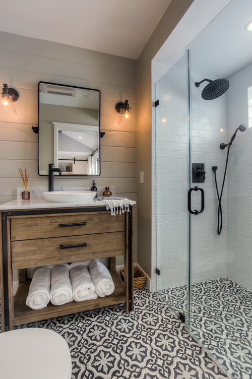
8. Bathroom - The bathroom can be styled with a vase of flowers (nothing ornate, think simple), maybe a white moth orchid and some crisp (new) white towels. I like to style the towels with a large towel and a medium towel draped over the top on a towel rail. If there is no rail, you could fold a towel neatly and place it on a low wooden stool with maybe a bar of soap on top.
Above: Keep it simple and make it green. These large palm leaves are all that is required to liven up what can be a clinical space. Image via - Dujardin Design Associates
Above: Image my own
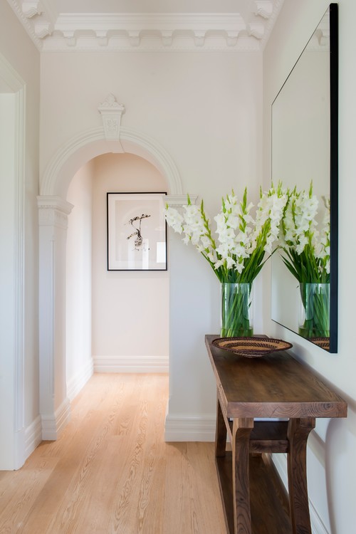
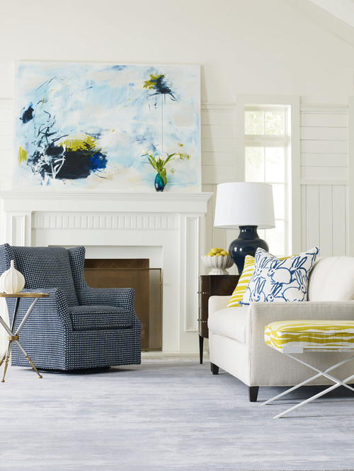
9. Art - You may or may not choose to hang art, if you do be selective. A contemporary piece that works with colours you may have introduced is the way to go. You can either rent art from a home staging company or a company that specialises in rental art. The cheapest way however, is likely to be from the home staging company. I would limit art to one focal piece in a room such as the image below and make sure it is a suitable size, Many people hang pieces that are too small or too high. If you would like to know more about choosing art, you may want to read up on a previous post "How to Select the Perfect Artwork". One last thing on art, in the first image on this post there is a wedding portrait, this is of course something you would proudly display in your own home but when it comes to staging a house to rent or for sale, remove any personal photography.
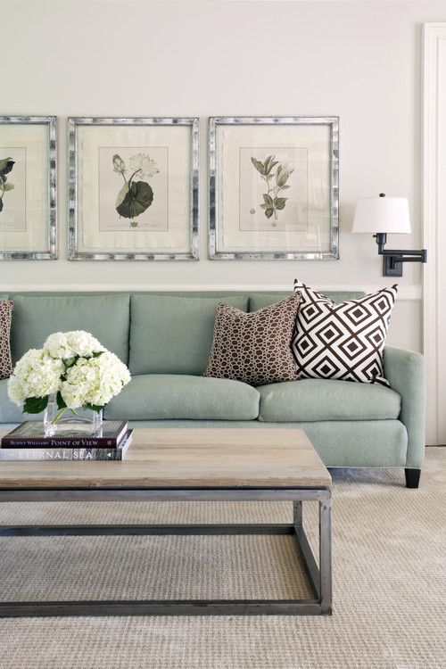
Above: The art compliments the colours in the cushions - Image via Nelson Design
I hope this post gives you an understanding how you can make your rental property stand out from the rest by staging, you won't regret spending that little bit extra and you will have the photos for future reference. Of course a rental has to be spotless inside and out, so if you missed last week's post on Curb Appeal, First Impressions" you can catch up here.










No comments:
Post a Comment
Thank you for your time to leave a comment, I ♥ to read your comments and try to reply to them all.