Image via Studio McGee
Designers know all the tricks when it comes to a beautiful space and one of those tricks is 'detail' as can be seen in this beautiful home.
Designers, Studio McGee stated that previously this interior had a few rustic details, rustic can feel somewhat heavy, so it has been re-designed with a light Hamptons feel.
To create a bright, airy atmosphere it is important to keep wall colours neutral, warm whites, soft greys and clean beige's work well. Be careful when selecting the right shade of white, a great "go to" white from Resene is Half Bianca. In this case McGee have chosen a palette of white with a tint of taupe to warm it up.
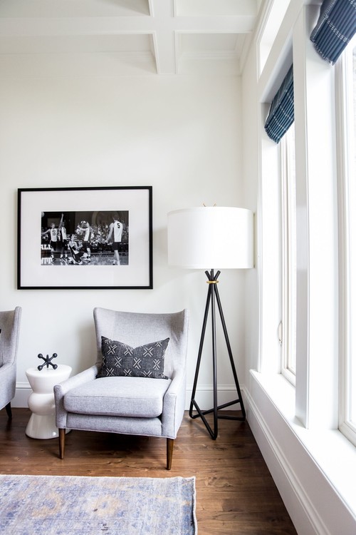
Furniture has been kept light using whites and beige, however, when you use a lot of white furniture, you need to make sure it doesn't look clinical, and that is where details are important. When I say "detail's", it may mean the addition of a feature wall using patterned wallpaper or the use of decorative items that will pull the overall look together. Colour and pattern will break up an expanse of white and the simplest way to do this is by the addition of cushions and some decorative items.
The choice of lighting is important too, this is where you can introduce variation with materials such as the use of rattan or different metallics. A selection of lights can be used for an interesting effect, but remember to look at the overall space and adjacent spaces so that the effect remains cohesive.
I recently purchased some gorgeous cushions to refresh my blue and white living room, they had the addition of some coral in them and at the moment they are not quite working, however should I add some detail in the room such as a coral chinoiserie jar to compliment the Pagoda pattern on the cushions it will unite the look. Once I get the perfect detail piece I will take some shots to show you what I mean. Meanwhile lets explore how the professionals do it...
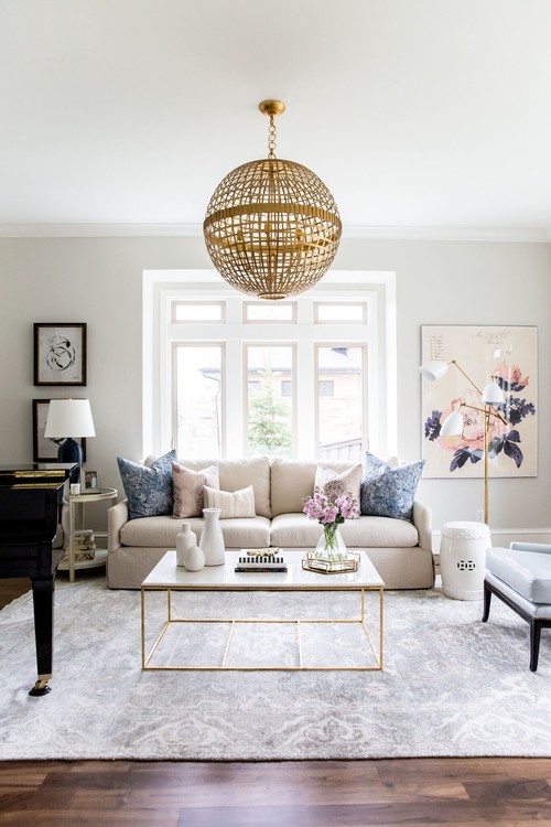
Above: The dark floors in this room have been broken up by a beautiful rug. The rug is subtly patterned in a way as to not draw the eye immediately,so when you look at this space your eye moves around the room from artwork to cushions to rug and then you notice the brass legs on the coffee table which work with the lamp to the right.
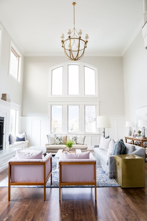
Above: The right choice of rug will immediately impact a space, lightening it and sometimes making it appear larger, especially with dark wooden floors.
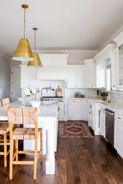
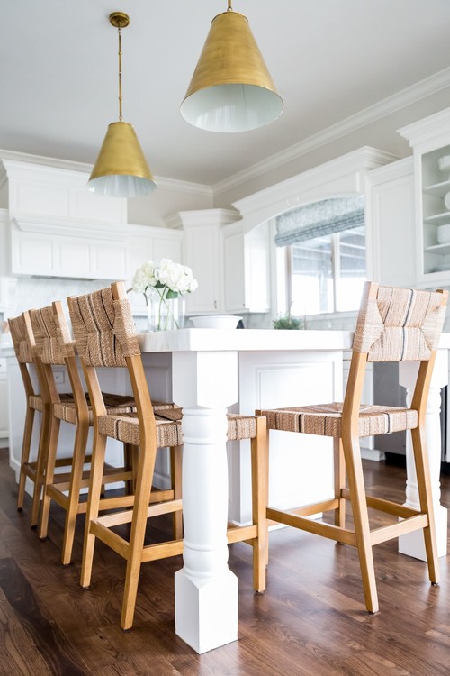
Above: Little details such as a simple glass vase of flowers on the island bench can make a world of difference.
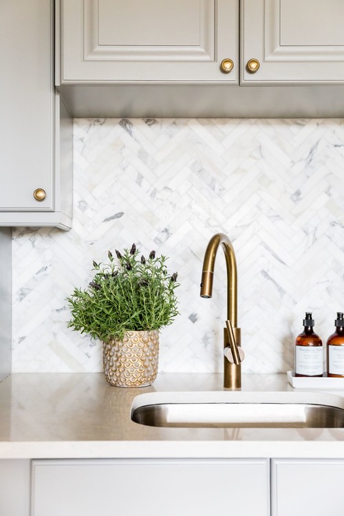
Above: Detail can be seen in choice of tiles on the splash back. Choosing a herringbone , marble tile adds much detail to the white kitchen. Selecting the right tap can also be added detail.
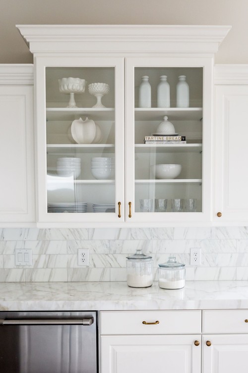
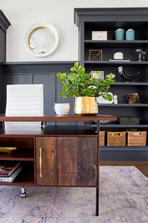
Above: Detail can be seen in the decorative items on the shelves
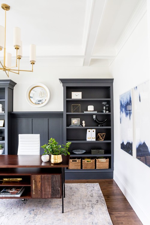
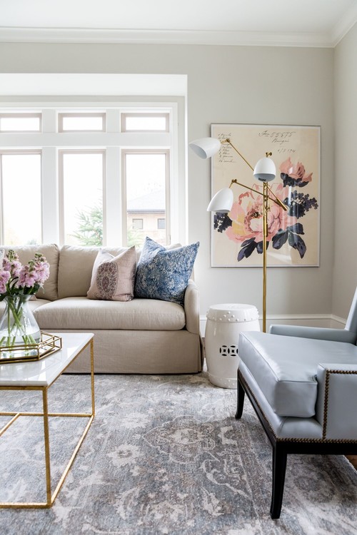
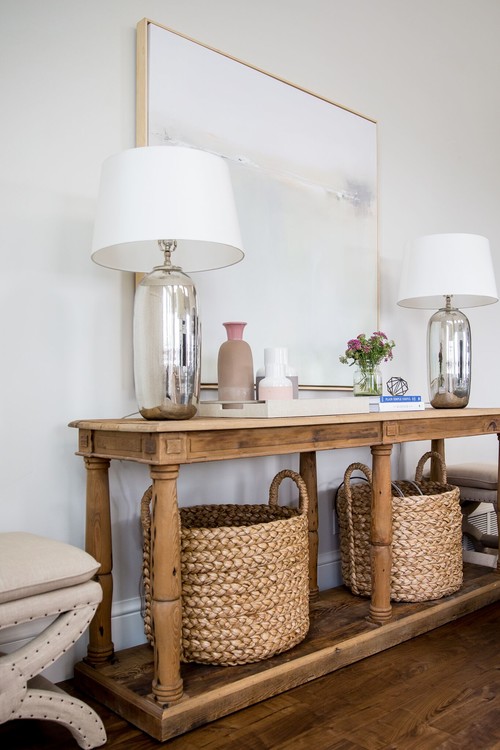
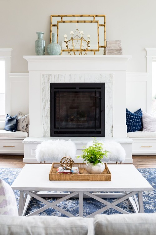
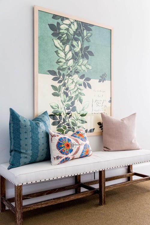
I suggest you analyse the following images to see how McGee have used detail to make the following spaces special...



No comments:
Post a Comment
Thank you for your time to leave a comment, I ♥ to read your comments and try to reply to them all.