

With the launch of the 2013 Spring Pantone fashion colour report, I've found my favourite colour, "Grayed Jade", its title describes this colour perfectly. A subtle jade with a touch of grey, giving it a slightly misty look. Or as Pantone describe it, "a subtle, hushed green". A very restful colour with a calming response.

How can we use this colour in our life, whether it be paint, tiles, fabrics or even glassware. From a slightly stronger tone to a paler version...


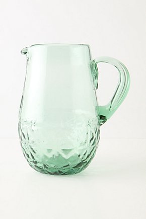
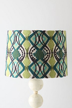
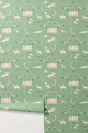
How about some touches of Grayed jade (or near enough), I have placed links on the images if you want to find out a little more about the product. All the products from Anthropologie ...
...
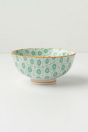
Bowls like this look lovely displayed on a shelf
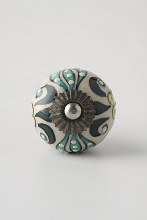
Replace some old draw handles with this lovely knob
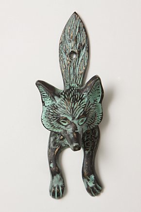
I think this little door knocker is fabulous, and reminds me I need to remove my mothers brass fox head before I sell her house. The patina on this little fellow looks very "Grayed Jade". If I didn't already have a similar one I would have bought him in a flash, but want to keep my mothers in the family, "so to speak".
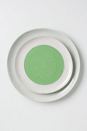
More inspiration to introduce a little of this colour to your home...
More inspiration to introduce a little of this colour to your home...
We hope you have a fabulous weekend, it is a glorious Spring day in Auckland, I'll be heading off shortly for the French market.
sharing this post with..

Love this post Lee! It's always great to see some ways you can incorporate something on trend in a realistic way.
ReplyDelete- Ididtellyou.blogspot.com