Last week I wrote a post on how to achieve a designer look using cushions to enhance a space, this week I wanted to touch on, what I consider is one of the most important features of good design, 'texture'.
The easiest way to discuss the importance of texture is by analysing images from professionally designed spaces. I have chosen the work of Australian designer, Space, Grace & Style. I first discovered Rebecca's work on Houzz and love her unique way of juxtaposing different materials to create wonderfully textural rooms. This post is not so much about using fabrics to introduce texture, but focuses on introducing texture by way of furnishing, lighting and decorative pieces.


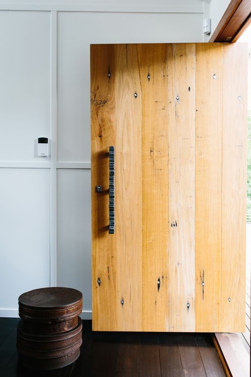
Above: This dining space screams texture, from the delicate and interesting chandelier to the chunky knitted look rug. The sliding carved door makes a fabulous statement. Wood, metal, rattan all come together to create the most interesting dining space. There is no need for fancy styling and lots of decorative pieces, the simplicity of the antlers is the icing on the cake.

Above: Styling Stephanie Stamatis - Photography Tara Pearce - A mix of textures and shapes in a contemporary kitchen

Above: This contemporary entryway not only uses the obvious in textures such as the wire framed chairs. If you look at the wall carefully you will see the paint or paper is mottled which gives a sense of more texture. The velvet striped bench seat adds contrast and the artwork has a textural appearance even though it is two dimensional. Texture doesn't have to necessarily mean 'tactile' you can have 'visual' textures that may be flat but patterns make them appear textured.
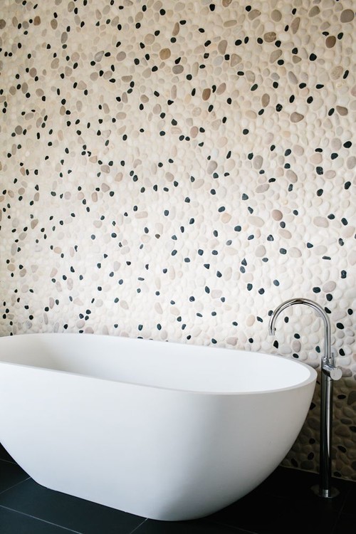
Above: Pebble textured walls juxtaposed against the smoothness of a white free standing bath, the small dark pebbles reflect the tones of the large tiles on the floor.
I have only touched on a few aspects of the use of texture and plan to share some more posts. Meanwhile I hope that I have made you a little more aware of the importance of texture in good design and how you may be able to introduce some into your home.
Space, Grace and Style design unique and beautiful spaces, so should you want the help of an interior designer and you love their style, you may like to visit their website to see more of their work.
Sharing this post with some of the following blogs:


This is called perfect classic designs. House Design is an art of decorating dream houses.
ReplyDelete