

Grey is often thought of as drab and unwelcoming but selecting the right shades of grey and complimenting them with the perfect choice of furniture and artwork and you can go from drab to totally divine.
Greys are not an easy option for decorating, it takes skill to achieve a relaxed atmosphere that doesn't feel cold or dull. For example deep, dark greys are moody and can feel imposing in a living room plus if you throw in a little red which I have seen many home stagers do, then you have a recipe for disaster. However, layer grey on grey in varied tones from light to dark with a background of white and you can have a beautifully relaxed look. Alternatively deep blue/grey paired with light coloured furnishing and statement art can make a beautiful but dramatic statement, such as in a study or library.
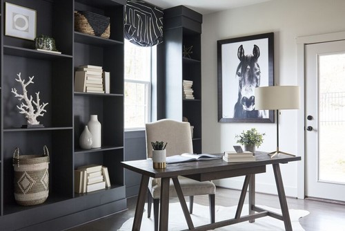
The room above is total drama, from the stand out artwork to the geometric cushions. The lamps have been cleverly chosen to compliment the cushions reflecting the dramatic lines in their design. It is important when planning a space, that everything is taken into consideration and repeating lines can make a room look seamless whether soft and curved or in this case sharp and angular. When creating a space like this you need to balance it and this has been cleverly done by the choice of artwork. The soft grey of the horse compliments the colours of this space and its pose softens the overall look. The designers, 'Creative Group Interiors' have been extremely witty with the placement of the artwork and the choice of a decorative bowl of apples beneath and have totally outdone themselves not only in this room but this entire project.
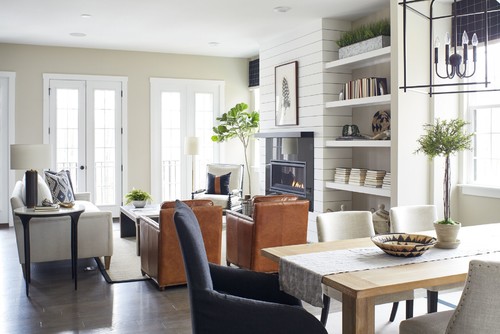
The living room is a balance of light and dark with light being the main focus, keeping this room airy and fresh. It is important to bring some contrast of colour and the brown leather chairs are perfect for this. Roman blinds and cushions in varying shades of blue/grey tie this space together.
The study area is a perfect example of co-coordinating light and dark. The dark grey bookshelves are dramatic paired with contrasting white decorative pieces and a mix of textures.
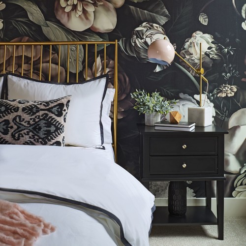
The two bedrooms are in total contrast to each other yet the same colour palette, this is made obvious by the dramatic floral, wallpaper seen in the second bedroom. The first bedroom has soft shades of blue/grey and stone, whereas the second bedroom opts for a dark, bold floral wallpaper offset by the brass bed. Should the designer have chosen a dark bed such as black, then it would have felt cold, the brass is a perfect choice for this space. It is important when introducing a colour that is not normally paired with grey that you use it elsewhere in the room and lighting is a good choice such as seen in the brass bedside lamps. The mink coloured throw adds softness, it is important when using deep, dark colours, especially greys that there is some softness too. I think this home is a perfect example of how to decorate with blue/greys successfully, don't you.
I hope this post has given you some ideas of how to decorate with blue toned greys, it is a beautiful colour and as you can see by these spaces, balanced out it can make the most beautiful space.

No comments:
Post a Comment
Thank you for your time to leave a comment, I ♥ to read your comments and try to reply to them all.