

A home void of colour and pattern lacks soul, the exception being a white interior where the designer may use neutral patterns and many different textures to bring it to life. However, this post is about colour and pattern and the easiest way to learn about this is to examine a designers project such as this beautiful home by Burnham Design.
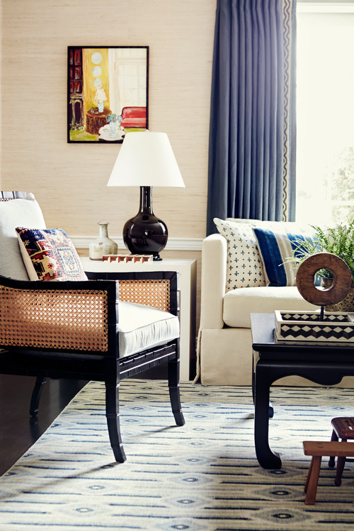
Above: The background is neutral but enlivened by bold blue curtains. The colour has likely been drawn from the rug and introduced into the cushions and curtains. The designers have mixed up patterns in the cushions and introduced a little red with the Aztec cushion to the left. Why does this work, because they have kept the tones of blue similar throughout and not introduced too many colours.
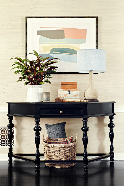
Above: This space has been enlivened with art. A plant adds varied tones and the cushion pattern.
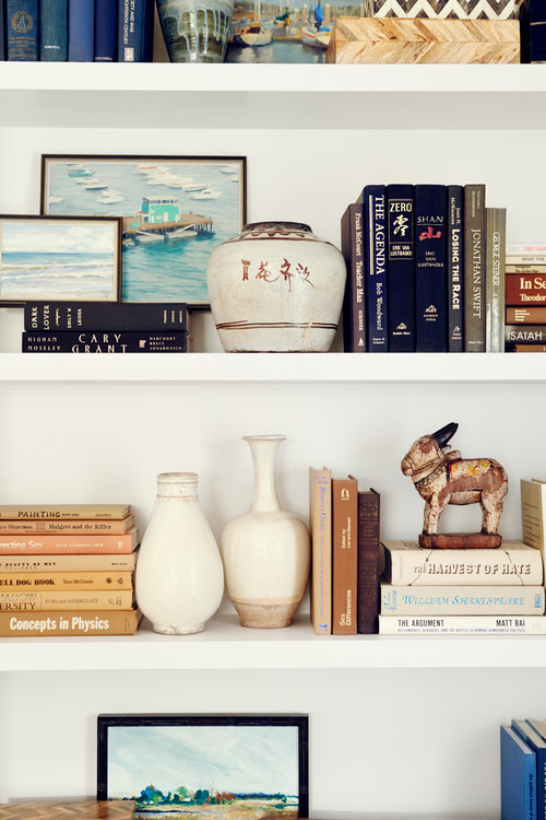
Above: The shelving mixes blues and natural tones by the clever placement of book spines. A book shelf is a great way to add interest and colour with accent pieces. Use pieces you love and work with them, don't go out and buy curated pieces.

Above: This is a space where colour has been kept to a minimum, you don't want to overwhelm an area where it is focused on relaxing in front of a TV, the space around the TV should not draw your eye away to the point of distraction. However that doesn't mean you cannot have colourful or patterned cushions behind your back.
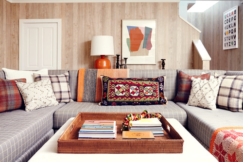
Above: A relaxed seating area in the TV room uses pattern and colour

Above: Such a clever space, who would have thought black and white stripes would work with ochre patterned tiles and an antique Rug. The designers have introduced a black painted chair whose lines work with the stripes on the staircase. The addition of the thin black frame on the artwork and the black handles on the right hand side cabinet tie it together.

Above: The kitchen is where I consider colour to be "less is best" and I feel that these designers do too. Opting for black bar stools against a pale grey kitchen keeps this area neutral.
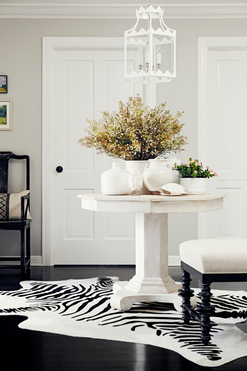
Above: Another neutral space but jazzed up with the strong lines on the zebra print rug.
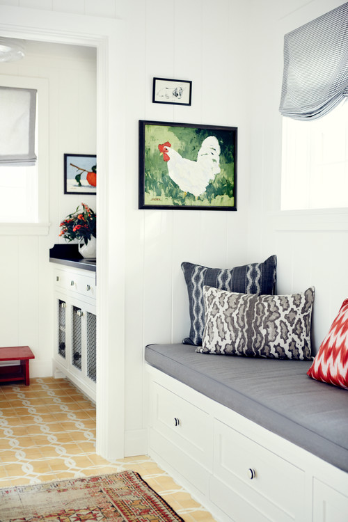
Above: A window seat is a great place to prop some coloured, patterned cushions.
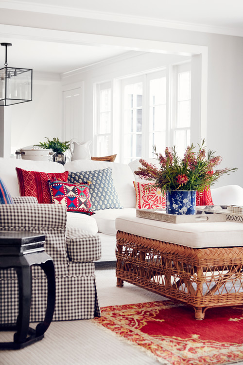
Above: The family room is a place where colour can be played with to create a relaxing but interesting space. Blue works beautifully with reds. This is where it can be fun to mix up pattern and colour.
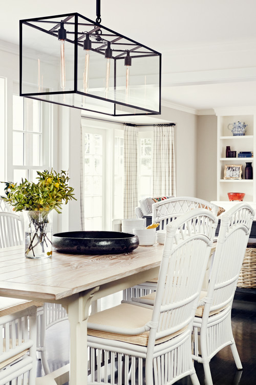
Above: Keeping that kitchen dining area neutral

Above: Add some colour to a kitchen with fresh flowers, they are simple, economical and you can change the colour on a whim.
Images above by Christopher Patey
If you love colour and pattern you may also want to check out this beach side apartment and "Take one White Sofa", where you can find simple but creative ways to add colour to a space.

No comments:
Post a Comment
Thank you for your time to leave a comment, I ♥ to read your comments and try to reply to them all.