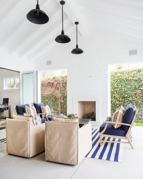
What if you built a new house with traditional farmhouse architecture but wanted to add a modern twist. What furniture would work and how could you achieve a contemporary look yet still retain the character and charm of a farmhouse? Today's tour is a Blackband Design favourite that hits the nail on the head when it comes to 'Modern Farmhouse style.'
Blackband have a distinctive style and are fast becoming one of my favourite interior design companies in the US. Usually I can spot Blackband's distinctive work by their unique way of combining pattern and colour and their style of furnishing. However, when it came to spotting this farmhouse project, the hallway image rather surprised me as it was not their familiar look. With this project Blackband wanted to combine "open plan with a fun interior making it the perfect place for family get together's and entertaining". A twist on modern farmhouse architecture, combining tradition with contemporary, cosy with minimalist, literally a surprise around each corner. I am sure you will enjoy this tour and hopefully gain a few ideas yourself.
Above: Modern farmhouse architecture built by Graystone Custom Builders
Above: A minimalist look to the hallway which is flooded with a light from a bank of bi-fold doors
Above: Adding a piece of luxury, contemporary furniture such as this Demilune velvet sofa is the foundation piece for this living area. Keeping vignettes simple and uncluttered will keep the look modern.
Above: To tone down formality, the addition of rustic wood such as this coffee table, pares the room back to a more relaxed style.
Above: A great layout for a relaxed open plan living/dining area. The use of lighting, and contemporary pieces such as the square edged coffee table add a modern look
Above: Identical chairs can balance a space perfectly, these can be any style, here these low backed chairs are contemporary, however, the white washed wood tones down the formality of the chairs.
Above: Adding some nature with plants, images and of course beautiful coral will immediately add a more relaxed feel. Blackband often throw in a cheetah cushion which I love as it adds that element of surprise and shows that animal prints can look good in any interior.
I don't condone taking coral from the sea and there are some fabulous faux corals you can buy like the ones sold by Kelly Hoppen which come under her 'Home Jewelry' section.
Above: When creating a vignette, don't just use the top of your console, think about what might look great underneath. This could be a large vase or urn, a pair of stools such as this or simply some large wicker storage baskets. The straight sides and chunky look of the console are a modern, relaxed style.
Above: Don't overdo rustic items if you wish for a contemporary farmhouse look. The blue and white vase, mercury glass vase and bone box keep the look light and modern. Black, conical shades are more contemporary than their glass cousins.
Above: Using a tray to keep vignettes together and be able to move things around for cleaning is a great idea. I wrote a post last year on 'A Stylists Favourite Tool', you may want to read it later.
Above: Round tables are perfect for smaller areas, they make for easy conversation and use little space. Combining a rustic table with more formal style chairs will give a modern farmhouse look (note the tray again),
Above: mix up patterns for cushions but try to keep to the same tones with maybe one accent colour. Be brave, add some cheetah :)
Above: The perfect solution to those summer evenings
Above: classic bobbin chairs combined with a modern metallic table gives this office area a modern look. Layering rugs, one on top of another is another way of introducing pattern. I love bobbin chairs but have yet to find anywhere that stock this varied style of chair in NZ, so if you know anywhere, please let me know.
Above: Blue tumbled limestone flooring with rustic accents combine with fabulous Carrara Marble as seen below in this master ensuite. Mixing stones will add interest and can be used as a way of toning down a formal look. This bathroom could have used a more contemporary style bath with simpler curves, however they have chosen to marry tradition with contemporary with this shape.
If you would like to see more of Blackband Design's work, or you have a project you would like them to help you with, please pop over to their website, I have included a link above. I find so much inspiration in their designs, a refreshing freedom of colour, pattern and texture that works so beautifully.
Have a wonderful weekend, wherever you are in the world.
Sharing this post with some of the following blogs:
Not Just A Housewife|No Minimalist Here|The Real Housewives of Riverton|My Romantic Home|Natasha in Oz|The 36th Avenue|Miss Mustard Seed


Really love this house, it's sparseness and looks fresh.
ReplyDeleteJane
Yes it has a fine balance between comfort and space Jane.
DeleteWhat a stunning property! Every room is beautifully decorated and designed. I've pinned this and will be referring back to this post regularly I'm sure! I'm so glad you shared this at #SundaysDownUnder!
ReplyDeleteBest wishes,
Natasha in Oz
Thanks Jane, I will add it to your Sunday's DownUnder although I am a little late as it is Monday now. I had a bit of a break last week.
DeleteThis is gorgeous! So clean, and fresh, and open. Please come share your blog posts over at the Home Matters Linky Party! We'd love to have you for a visit. The Door Opens Friday! :)
ReplyDelete~Lorelai
Life With Lorelai
Thanks Lorelai, would love to link this post up with your blog, thanks :)
DeleteNice post. Thank you for sharing it.
ReplyDeleteModern Furniture
Thank you for visiting and taking time to leave a comment :)
Delete